Alita: Battle Angel

Alita 1

It has been quite a while since I have written a post on 3D. Alita: Battle Angel (2019) marks a type of anniversary for me. It’s almost 10 years since Avatar’s (2009) release, when I first became serious about studying 3D cinema. What’s fascinating about Alita is that, for all its advanced visual effects, it closely follows a stereoscopic 3D formula established by Hollywood almost a decade ago. This is not entirely surprising considering director Robert Rodriguez and producers James Cameron and Jon Landau have a long history working in digital 3D.

Alita is also a film that shows Hollywood’s attempts to move forward in the area of representation whilst keeping a foot firmly in the safe narrative strategies that maintain box office appeal. While Alita has one of the few female action hero leads of the last decade, and while the casting has been hailed as diverse, this is still Hollywood holding on to storytelling of the past: a heterosexual love story forms the core of the emotional entanglement; beyond Alita women of colour are given bit parts in the form of a nurse and women-to-be-assaulted-at-night; one token women is added to the gang of bounty hunter bad asses (no speaking role); the first significant man of colour to be seen, Vector, is (of course) the baddie.

alita 2.jpg

It’s within this framework that the stereoscopic effects push at the boundaries of visual imagery but are closely tethered to the narrative so that safe storytelling can take place. As the film opens on mid-shots of Dr Ido amongst the debris of a massive junkyard underneath the sky city Zalem, there is carefully placed fore, mid and background depth. This is emphasised in the shot when he discovers the head and torso of a cyborg: the small screen with translucent data that he holds up to scan the cyborg provides the midpoint in a three stage depth set-up. The next scene, inside Ido’s laboratory mixes a steam punk aesthetic of antiquated machinery and equipment with numerous translucent screens that emphasise the spatial possibilities of data. 3D is used here to emphasise the configurations of a dystopian future world that we are gently invited in to.

When the cyborg, Alita, wakes up in the next scene she is surrounded by comforting blankets in a snugly bed. Striking close-ups on Alita’s face, drawing attention to her large eyes, and then her robotic arm as it stretches horizontally across the screen give us the sense of the uncanny valley. However, the stereoscopic depth has placed us in close intimate contact with her. The 3D allows us an emotional connection as we come to terms with Alita’s difference. Not just difference in that Alita is a cyborg but difference in that we have a female protagonist in this richly created science fiction world.

alita 3.jpg

Downstairs, in Ido’s kitchen the over the shoulder two-shots between Ido and Alita are arranged to display further emotional connections – joy in Alita’s face as she tastes an orange for the first time; tears in her eyes as she realises she doesn’t know who she is; Ido’s empathy with both these moments. The stereoscopic depth enhances the placement of these two characters but there is also a strong sense of ontological difference. This is not simply at the narrative level: between a cyborg and a human. Rather it is at the level of the image. While Alita’s face and body are rendered in fine detail, she is still visibly of digital construction and not of the same visual constitution as the photographed actor playing Ido. This is emphasised by the subtle depth relations that make the difference in detail between the two apparent. Further to this, while stereoscopic depth emphasises where they are placed in relation to one another, the use of shallow focus suggests the characters have their own, particular, space in this relationship.

The first third of the film is typical of these moments and thus typical of digital Hollywood 3D. There are extensive depth relations in positive parallax space but objects in the foreground – mostly static – only protrude very gently into negative parallax space. There are almost no objects traversing the z-axis from foreground to background or vice versa. Stereoscopic depth is used for the creation and emphasis on relationships and spatial placement but is not meant to draw attention to itself or be seen as assaulting the audience. One of the few exceptions is when Alita and love interest, Hugo, are on top of a building in Iron City. There is one vertiginous shot where they/we look down the side of the building to the street far below at the same time as an aerial points towards the audience. It is the slightest teaser of the more dynamic depth relations that will come later in the film; a temperate reminder that there is a reason we have paid the 3D surcharge.

alita 4

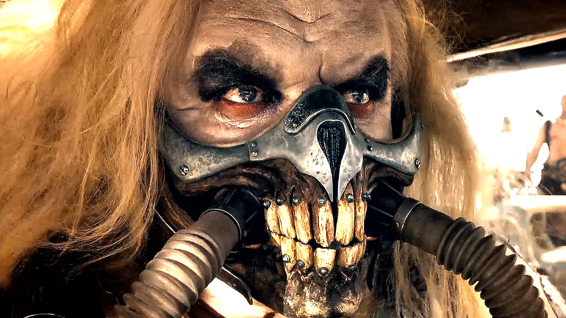
A little later the first battle between Alita and other cyborgs takes place as she and Ido are confronted in an alleyway. There is a similar ontological difference between the CGI cyborgs and the human Ido. It is the moment when the film confronts us with the alien difference of Alita – with her in built violent responses – while also asking us to invest in her powerful momentum. Just before Alita attacks the cyborg Grewishka, she performs a high kick that seems aimed right at the audience as she traverses negative parallax space. This is followed by Alita’s movement forward that leads to an intense close-up on one of her eyes: a cinematographic feat only stereoscopically possible with advanced digital compositing. It is the stereoscopic equivalent of the narrative turning point: a ramping up of depth intensity which sets a new norm for depth intensity and use of negative parallax space for the rest of the film. It is no coincidence that it comes at exactly the same moment as the narrative’s first turning point.

As the film progresses Alita’s strength increases and stereoscopic effects become more intense. In the bar fight, stereoscopic debris occurs as glass shatters towards the audience and splintering wood shoots into negative parallax space. Notably, the former takes place in slow motion, announcing the moment at which the film has sufficiently gained the trust of the audience to overtly show off its spectacular manifestations. After the initial bar fight, Ido enters and manages to get the fighters to calm down and remain still. Like the choreography of a complicated dance momentarily paused, the stereoscopic depth allows the spatial relationships of the characters to be seen. It is only a short pauses and Grewishka soon enters the scene. The audience is now primed for full use of the z-axis and this is granted when Grewishka crashes through the floor into the ‘underworld,’ allowing a fight along the z-axis to ensue between him and Alita. His mechanical tendrils frequently shoot directly towards the audience as well as away from them, often in slow motion so the full effect of his assaultive power is clear.

alita.gif

In line with the flow in and out of intensity in the narrative’s dramatic action, the use of stereoscopic depth fields also strengthens and relaxes. There is the ubiquitous use of an underwater scene when Alita jumps down into a lake where a URM spacecrafts from Mars crashed. In this moment, objects surround us in a tranquil manner while Alita appears calm. Soon after, action and stereoscopic effects gear up again.

When the second, climatic, Motor Ball battle occurs, it is much more kinaesthetically charged. Alita has mastered the use of a new cyborg body and we are invited along for the ride. Shots are set up in a phantom ride aesthetic where we feel that we are propelled into the fast moving scene. When the characters break out of the Motor Ball arena and along a series of pipes above the city, the perforated pipes gush water straight at the audience so that we experience the same momentum and counter force as the characters do.

Combined, stereoscopic effects and a narrative arc that takes Alita from broken mechanical parts to a dynamic action hero allow the audience to fully understand the irony when Alita states “and I’m just an insignificant girl” before slaying Grewishka. What is significant about Alita is that she has paved the way for a reinvigoration of the female action figure. However, this isn’t without cost.

When Alita is helped by Ido to enter her new cyborg body, one made from URM material, he notes that the cyborg body adjusts to match Alita. Ido says: “her shell is reconfiguring to the subconscious image of herself.” Significantly, this subconscious image, which becomes materialised, is the impossibly thin yet curvaceous body: delicately thin limbs and waist combined with substantial breasts and buttocks. So far, this body has only been possible in graphic illustrations or via substantial photo shop. I’ve written previously about the problems photographers have encountered when trying to manipulate bodies to meet this ideal at the same time as using stereoscopic depth. Alita is able to achieve it only via the use of a cyborg body created in performance capture.

alita 5

In this way, Alita sums up the possibilities of combining stereoscopy and advanced visual effects to meet both narrative and aesthetic future-facing aims. However, Hollywood has a way to go before it can truly shine light on the potential for diverse bodies and new action heroes.

VR/360/AR/MR

It’s been a while since I’ve written about films and that is mainly because my research activity has been consumed by work on Virtual Reality for the last 12 months. As part of the Colliding Worlds: Virtual Reality and Beyond project at Victoria University of Wellington, I’ve been working with Professor Neil Dodgson and Matt Plumber to bring together academics in different disciplines to share their expertise on VR as well as think about the crossovers with 360-degree imaging, Augmented Reality and Mixed Reality. This has led to some of my own experiments with 360-degree filming and will hopefully lead to more practice-based research in the future.

Although I’m interested in the multifaceted cultural and industrial contexts in which VR content is being produced, my background in Film Studies means I’m most intrigued by the new wave of cinematic VR content. I include 360-degree filmmaking in this even though VR purists might argue that its lack of interactivity means that it does not truly present a virtual reality. What’s likely to come, then, is a series of blog posts where I take a close look at some VR ‘experiences’ and, similar to my posts on 3D films, try to find emerging trends and themes.

d2605e3d47e0c3d63e1f57a5c3dbaf15

All three of the experiences that I am looking at in this post are hosted on the Jaunt platform. One of the useful things about the Jaunt platform is that it can be viewed on desktop computers (I use Firefox and, as far as I know, it also works in Chrome). You don’t get the same immersive experience that occurs when you view the experiences in a VR headset (I’ve been using the HTC Vive headset for viewing) but you can use your mouse to navigate your way around the 360-degree spherical view. I would liken this viewing possibility to the difference between watching 2D and 3D versions of the same film: the desktop version lets you follow the narrative and grasp many of the aesthetic qualities but you don’t have the same multi-sensory, embodied, closeness that you get in the headset view. The following experiences are a somewhat random selection of content currently available on Jaunt but they do point towards some of the different and similar ways that filmmakers are approaching cinematic VR.

Always Sunny in Philadelphia: Project Badass

The Always Sunny in Philadelphia experience isn’t the first time Jaunt has teamed up with a well-known brand; the platform has already produced content in collaboration with Star Wars, ABC news, The North Face, ESPN and others. It is similar to many other spin-off/tie-in VR experiences whereby a mini narrative is produced that fits into the fictional world of the brand (the Always Sunny in Philadelphia TV series) but is not necessary-viewing for anyone following the rest of the entertainment series. In this case, biker Mac invites viewers to follow him as he creates yet another video to prove to his friends that he is ‘badass,’ this time by attempting to ride his motorbike off the end of a pier.

maxresdefault

Like many other cinematic VR experiences, the opening shot situate the viewer in the very centre of a visually rich scenario. Positioned on top of Mac’s motorbike, you can see a small crowd of people waiting eagerly at the bottom of the pier, a large crane behind you and the ocean populated with surfers stretching out on either side. The shot encourages you to crane your neck to look around but, in doing so, you are in no danger of missing any of the narrative as the characters remain in relatively fixed positions, talking rather than completing any complex action. This central, immovable, position is justified in the narrative when Mac’s friends Dee and Dennis discuss you as if you are there, a friend of Mac who is strapped to the motorbike and forced along for the ride. While this type of exposition, explaining why you are situated where you are, is starting to feel somewhat over justified in VR experiences, it does have the effect of allowing characters to talk to the viewer directly so that this fourth-wall-breaking lends a greater sense of presence. The dialogue is crafted to allow this to happen: you are asked rhetorical questions and none of the comments suggest gender, ethnicity, age or other identifiers that would suggest someone other than you is being talked to. Furthermore, this set up provides justification for why the viewer is given access to a privileged position amongst the inner circle characters; something that the diegetic spectators at the end of the pier are not allowed. Rather than operating as the omnipresent viewer common to 2D cinema who can witness all action, but from a distance, the viewer is grounded centrally and expected to feel events as they occur.

At the same time, Mac’s friend Frank playfully undermines the experiential concentration of the viewer by presenting a stripper ready to take her clothes off to the song Uptown Funk. Telling Mac, ‘if you want people to see your video, you’ve got to have some skin,’ Frank suggest what we have always been suspicious off: that viewers prefer to be the voyeur rather than active participants. Mac’s response ‘it’s going to distract from the performance’ also highlights a conundrum facing creators of 360-degree content. The lack of a frame means that it is impossible to focus viewer attention in sustained ways and so narrative has to be able to take into account the increased opportunity for visual distraction.

alwaysunny_360_video

When the motorbike finally takes off, there is an extremely visceral feeling of speed as it races along the pier, even though your view point is partially blocked by Mac driving the bike. After zooming up the ramp, the bike crashes into the water so that we are subsumed in the depths of the ocean. In the same way that many underwater scenes occurred in 3D films, it is likely that cinematic VR will capitalise on the greater sense of sensory immersion that these visual technologies can create when placed in liquid fields. In this short segment, the experience thus combines the visceral feeling of motion and immersive submersion that many recent VR ‘demos’ used to promote the new wave of VR headsets.

One last thing worth mentioning is that Always Sunny in Philadelphia is shot as if it were a one-take film. There are in fact a number of ‘hidden’ cuts: one of the characters momentarily places a hood on the viewer’s head (presumably allowing the change from actor Rob McElhenney to a stunt double); the motorbike travels through smoke leading to a white out (allowing the stunt man to be removed from shot before the bike hits the water). However, the sense of uninterrupted action adheres to the idea that VR experiences should immerse us in the world as if we were really there. No cuts in reality translate to no cuts in this artificial visual world. While I’m not in favour of sticking dogmatically to principles such as this, for a short cinematic experience like Always Sunny in Philadelphia the lack of edits give it a self-contained quality that emphasises the simple goal of experiencing something thrilling: a daredevil stunt with the potential to go horribly wrong.

My Brother’s Keeper

Unlike Always Sunny in Philadelphia, My Brother’s Keeper is a stand-alone 11-minute experience. Set in the US Civil War and depicting two brothers on either side of the conflict, the experience treats much more serious themes than the former. The slow pace of the experience suits the long shots which allow significant time to look around (towering crop fields interspersed with soldiers, forests providing cover for advancing troops, flashbacks to the places where the brothers played as children). In most cases, the edits are gentle ellipses across time that allow us to transition from one scene to the next. Even when they become more rapid, they move us through time or to a completely different space rather than allow us a different perspective on the same scene. In this way, My Brother’s Keeper follows a standard, that has been set up in the first wave of twenty-first century VR cinematic content, in order to minimise the disruptions that edits impose on the embodied presence of the viewer. Nonetheless, there are experiments with expressive shot construction that move the experiences away from an overtly realist visual framework. When a type of shot/reverse-shot occurs with each of the brothers (current age and their childhood version) shooting their guns in individual shots, we are given the feeling that they are interacting with each other even though they are not in the same space. This is emphasised by a type of blurring out of the 180-degrees field in front of them, an artistic diminishing of the plentiful 360-degree view. The effect feels quite jarring but I am inclined to believe it is because we are only at the initial stages of expressionistic experiments with 360-degree cinema language and it will take a while for viewers to become accustomed to them.

20170119_164407_64214420170118_032019_717956mbk_btsgallery_5-jpg-1280x720_q85

My Brother’s Keeper also plays around with camera positioning in a way that I haven’t seen in other 360-degree experiences. In a dramatic moment towards the end of the experience, one brother (then the other) is knocked to the ground and the camera lays next to him. Our balance is shifted as we are still upright in our external viewing position but laying on the ground in our internal view of the brother. Although we are used to seeing the camera tilt, move onto its side and even go upside down in 2D cinema, the lack of frame in the 360-degree spherical view makes this a much more disarming experience. It is a little like what happens in 3D films when this unbalancing of the cameras’ equilibrium asks our bodies to react more keenly.

Helping us through these experiments with the visual field is a continual voice over from one of the brothers. While not uncommon in 2D cinema, I have the feeling that voice over is becoming prevalent in cinematic VR for a number of reasons. In the first instance, it allows a sense of continuity as we are moved from one spherical field of view to the next: a sensation that can be jarring for first time users of VR headsets. Secondly, the disembodiment of the voice-over helps us remember that embodiment in virtual spaces is contingent rather than a given so that we are open to having our sense of embodiment in the virtual space played with. Finally, one of the difficulties of shooting within a 360-degree spherical field of view is that it is hard to direct viewer attention to where they should look when they can potentially look in any direction. Providing exposition and narrative information within a voice-over that is not dependent upon what the viewer is looking towards at any given time is thus useful for the storytelling process.

image_thumbnail_2_v1484907881

One of the ways in which the Jaunt platform has been supporting new work such as My Brother’s Keeper is through the provision of a 360-degree camera rig. Included in their rig are enough cameras for stereoscopic capture. Although the different images produced by stereoscopic visual sets compared to monoscopic visual sets in 360-degree filmmaking are less obvious than in traditional screen media where the frame makes it clear if objects are in front of or behind the screen plane and thus imbued with additional depth, there are some moments when stereoscopic 360-degree shooting makes a difference. In My Brother’s Keeper this most commonly occurs when we are placed very close to one of the brothers and are encouraged to concentrate on their faces in the same way when confronted with an extreme close-up. Stereoscopy in these shots means that our heightened depth perception is matched with a visual understanding of the intricate contours of their faces so that we are presented with a more intense engagement with the characters. In one particular shot, one of the brothers holds a shotgun and its long barrel extends from his shoulder and into the inner sphere of our personal space. The stereoscopic depth relations allow a greater sense of connection between the fictional object and the embodied space that we occupy. At the same time, one of the difficulties of working with a stereoscopic 360-degree camera rig is that it is much more difficult to stitch all the different images together into one spherical field of view. Certain artefacts of this imprecise process remain in My Brother’s Keeper when, for example, some objects bulge towards us when they should recede and vice versa.

Invisible, 1: Ripped from Reality

Of the three experiences, the first episode of Invisible, an original content six-part VR series produced by Jaunt, is one of the most experimental in terms of editing and visual effects. Its supernatural theme and science fiction feel means that it is distinct from the numerous documentaries and other realist works that have so far provided the bulk of VR cinematic content. Indeed, the episode’s title ‘Ripped from Reality’ indicates that this will be the case. Opening on a street in Haiti, a girl passes by our central position but specifically peers at us, thus breaking the fourth wall and giving us a sense of presence at the scene. In this way, we are given a type of POV shot that situates us in the scene but, a few seconds later when the experience cuts to the inside of a house where a young woman, Susan, is in labour, spatial edits jump us across space to the other side of the room. This type of edit, giving us different viewpoints on the same scene, situate us as the omnipresent viewer common to 2D cinema. However, the lack of frame to allow us to feel outside the scene means that we feel as if our whole body jumps with us, rather than just our viewpoint. As with My Brother’s Keeper, the use of a voice-over from Tatiana (Susan’s cousin) during this scene helps narrative flow as the viewer keeps up with the movement around visual space.

invisible-1

Shortly after, there is a change of scene to excerpts from news footage that explain the death of Tatiana’s grandfather. This information is displayed as a series of screens within the 360-degree sphere, stretching all around us and competing for attention. It is a simple set up but one that reminds us that we are within a new visual scenario that is different from the framed screens represented by the news footage.  We then enter a series of credits that begin with an aerial shot taking us over a suburban landscape. When looking ahead, in the direction the camera is travelling, the footage is clear but when looking behind, a type of wave-like visual effect blurs the landscape. Similar to the visual effects in My Brother’s Keeper, this shot moves away from a realist framework and towards a visual experience that is more expressive. This is particularly apt in the next shot of the credits where we seem to be placed with a foetus inside the womb: a quite creepy scenario, particularly as the foetus has an uncanny, digital quality.

In the next scene, in a hospital, we are positioned at the intersection of two corridors, meaning it is possible to view two related but separate pieces of action unfolding at the same time: an anxious pair of relatives and Susan’s boyfriend approaching another relative. There is also action in other directions as patients and hospital workers move around the space. Previously, this type of multiple action would only have been viewable using split screen effects. Now there is the opportunity for the viewer to decide which piece of action they will turn their head towards and it is this potential that is leading many filmmakers to call 360-degree cinema interactive even though it does not have the 6 degrees of freedom in movement that other interactive VR experiences allow.

inv_tlr3_susan_penultimateshot

Following a series of spatial cuts that take us around the hospital, we see a series of strange events occur as a semi invisible body attacks numerous people. In some ways, because we are so close the action, and feel physically amongst it, the over-dramatic acting and the there/not-there quality of the digitally created semi-invisible body means that the scenario becomes farcical. However, when the semi invisible body comes towards, and seems to cover us there is a feeling of encroachment on our bodies, an amplification of the looming effect in other media (think of the jumpy moments in horror films when a monster lunges at you and you feel the need to physically recoil). When we later see one of the relatives dead on the floor, the stereoscopic depth relations allow him to stretch towards us and increase the sense of co-presence in the space. This aspect, combined with the looming effect mean that there is a more heightened sense of sensory stimuli than can be found in other 360 experiences.

Taken together, these three Jaunt experiences offer a good snapshot of the current state of fictional VR cinematic 360-degree storytelling. Their experiments as well as their repetitions of established 360-degree tropes point to the exploration that is taking place in this area yet their short duration – no more than 11 minutes – also indicates that it might be some time before filmmakers work out how to combine these elements in effective feature-length storytelling.

Stereoscopic Star Wars: The Force Awakens

SW-THE-FORCE-AWAKENS

***spoilers***

I am the worst of the 30-something cliched Star Wars fans. Having fallen in love with the original three as a small child and having hated the first three when they were released in digital splendor, I have just enough experience to be highly opinionated but haven’t enough knowledge to hold my own in a proper Star Wars debate. There are plenty of us putting our opinion out there online and so I won’t pretend I can add much to analysis of Star Wars: The Force Awakens’ plot and characters even when I did like it a lot and fell in love with Rey and what she adds to a male-dominated global Hollywood. Instead, I’ll do what I usually do and write about what was going on with the stereoscopy in the film.


The Force Awakens should have been a stereographer’s dream film. It has everything you need to showcase the latest advancements in digital 3D technology: plentiful battle scenes allowing plot motivated material flying at you in the auditorium; vast science fiction landscapes to demonstrate positive parallax receding depth; large space crafts that produce the cavernous interiors that 3D depicts so well; phantom rides as the camera moves rapidly into scenes, made more exhilarating by stereoscopy; and various translucent telecommunication scenes that show the way different depth planes can layer on top of one another. But it was a post-production conversion to 3D and at times it shows.

Star-Wars-7-Force-Awakens-Teedo-Luggabeast

For starters, take the opening title – “A long time ago in a galaxy far away.” The neon blue letters on a black screen are faithful to the original but whereas the original had a slight analogue shake that softened them, these letters look they have been added using the Basic Title function in Final Cut. Although they are aligned, the contrast between the letters and the background sit uneasily in stereoscopic depth, not seeming to rest on a particular plane but rather floating somewhat out of synch. Following on, the famous explanatory text then nicely scrolls backwards into positive parallax space but a strong decision about the starscape behind it hasn’t been made.There is neither the textural fabric of stars (not stereoscopically accurate due to our inability to perceive stereoscopic depth when looking at objects that far away but visually beautiful) that have appeared in Gravity and The Martian nor is there a straightforward flat starscape at a distance. Instead, there is a rather weak dusting of twinkling lights that does nothing to engage the viewer as the starscape transitions into the opening shot of the planet Jakku. Complaining about this probably makes me seem very pedantic but these are the small details that a good stereographer or cinematographer with an eye for stereoscopy would work on.


Shortly after, when Poe Dameron and Lor San Tekka step outside to watch the First Order ships arrive, the rack focus technique is used to shift Poe out of focus in the foreground and bring Lor into focus in the background. Racking focus like this is common across contemporary Hollywood but it creates a more striking visual effect when performed in 3D cinema. It suddenly becomes more emphatic and there is a noticeable transition as two separate parts of the screen space seem to transform simultaneously. In the 2D version it is akin to our eyes gently shifting from one area to another whereas in the 3D version it seems like the visual world undergoes a significant change. In this way it is a little like the dolly zoom that was made famous in Jaws, a dramatic technique that adds tension and suspense to the scene. This would be fine if the scene needed the extra emphasis but it seems as if the shot was designed for the 2D version and was only meant to be a subtle shift from one character to the other. Throughout the film other shifts in focus occur that take on their own visual emphasis in 3D but seem to do so against the flow of the aesthetic and editing rather than with it.


Following a trend initiated in Avatar and epitomized in The Hobbit trilogy, roving cameras are used that sweep and soar with the characters as well as dart towards and away from them. Their use goes against orthodox approaches to stereoscopic filmmaking that prefer static shots and long takes so that the viewer’s eyes have time to take in extended depth relations. Nonetheless they fit a contemporary Hollywood style and public expectation for dramatic action scenes so it is unsurprising that the majority of 3D blockbusters use them. While some Hollywood 3D films are able to construct these shots so that they interact with the spatial configurations of objects in the back, mid and foreground, there is little evidence that this has taken place in The Force Awakens. Instead, stereoscopy is only able to enhance depth relations in a very limited way in these scenes.

John-Boyega-as-Finn-in-Star-Wars-The-Force-Awakens

At the same time, post-production conversion technology has come a long way in the last few years and when there is ample material to work with, there is still the ability to produce scenes that are visually more dynamic than their 2D counterparts. In The Force Awakens this occurs most often in the close-ups on characters when the cameras finally rest and there are relatively static shots. For example, when Finn decides to defect from the First Order, every bead of sweat and furrow in his brow is clearly and intensely visible, an aspect matched during the close-up of Poe when he is tortured by Kylo Ren. In another relatively static shot, shortly after being introduced to Rey, we see her slide down a vast sand dune and the stereoscopy helps emphasise how small she is amongst the great trench of sand. While the film has been praised for not relying too heavily on CGI, one aspect that works well with the stereoscopy is the depiction of telecommunication scenes and holography. When the final piece of the holographic map is inserted and Hans Solo walks through the translucent data fields, it feels like we walk through it with him.

ZZ15893205

As much as the telecommunications screens are a nod to our digital present, the film does a good job of pointing to the past. Surprisingly, the cheesy wipes and other transitions that haven’t been seen much in recent years work fine stereoscopically and don’t upset our visual sense of space and place. There are also occasional nods (whether intentional or not) to the famous moment in twentieth century 3D when Grace Kelly reaches her hand out directly towards the audience in Dial M for Murder. It occurs most often when characters reach for their lightsaber, a shot set-up that exists in the original films but becomes emphatic as it seems that they really do reach towards us at the same time we know they have no idea we are watching them.
There are hints, then, of how stereoscopy can add to the visual worlds created in the Star Wars franchise and in many ways this is what is most frustrating as it shows what could be achieved if a proper stereoscopy team were brought on board rather than merely handing over to the post-production team at the end. Whether or not Rian Johnson, director of the next two films, will take a different approach is yet to be seen but considering he wrote in 2012 that he would never shoot in 3D, I’m not too optimistic.

3D on Repeat: The Martian and The Walk

144315529018321_1024x576 ET00034094

Since I began writing about 3D films, and particularly since I began this blog, I’ve been trying to keep an eye on recurring themes, visual motifs and stylistic additions that might suggest an emerging consolidation of stereoscopic aesthetics in the new era of digital 3D cinema. In many ways this is an attempt to move beyond the popular discussions of 3D films that often reduce their unique aesthetic to a barrage of spears and other items flying at the audience. So far I’ve identified tendencies to use liquid fields (particularly when characters are submerged underwater), stereoscopic debris (small items such as shrapnel and dust motes fly around the screen space), vertiginous shots (often from the top of skyscrapers), and dynamic shifts between deep and shallow focus. It caught my attention that two recent films, The Martian (2015) and The Walk (2015), don’t just incorporate some of these elements but wholeheartedly copy tendencies in recent 3D films, specifically Gravity (2013) and The Young and Prodigious T.S. Spivet (2013). I’m less interested in whether or not this replication was intentional and more interested in what it says about commercial film industries that are developing stylistic tendencies that build upon traditional cinema modes as well as incorporate the new possibilities that stereoscopy brings.

The closest comparison is between The Martian and Gravity. Even at plot level they are remarkably similar: in both films we begin with wise-cracking astronauts away from Planet Earth who are suddenly hit by a dangerous storm. In each case the protagonists of the films, Ryan Stone (Gravity) and Mark Watney (The Martian), are left to fend for themselves as they try to return home. Both films have gained attention for their dramatic yet potentially realist depictions of space with scientists weighing in on whether or not the events in Gravity and The Martian are plausible. With regards to 3D, the initial storm allows for effective use of stereoscopic debris with parts of a blown-up satellite hurtling towards the characters and audience in Gravity and sharp fragments from the dust storm flying around the screen space in The Martian. The encroachment of this material into the auditorium is a more subtle use of negative parallax space that critics tends to favour, justifying it as a necessary part of plot and character development rather than a gratuitous display. Although both films have been complimented on their use of realist stereoscopy, they both cheat depth relations a little for dramatic vistas. The human eye tends not to perceive stereoscopic depth beyond a certain point, and definitely not at the distance of far away stars and planet. Nonetheless, The Martian opens on a starscape that is textured with modulating depth. In Gravity, Earth seems to have similar depth-rich surfaces even though these would not be visible from the character’s viewpoint in space. Again, it is possible to see how this use of stereoscopy fits in with the more conservative applications of 3D that high budget Hollywood films tend to aim for and critics prefer.

GRAVITY

The main difference in the use of stereoscopic visual fields in Gravity and The Martian is the latter’s frequent landscape shots. In the depiction of Mars we see an alien land, as yet undiscovered compared to the overly familiar Earth which hangs beneath the characters in Gravity. The long shots of the rocky red terrain remind us of the actualities of early cinema but it is now stereoscopic technology, rather than the novelty of moving images, which delivers the attraction. When the storm arrives, dust clouds roll down across the screen space in a way not dissimilar to the spectacular shots of a wall of water ready to rain down on Moses and his followers in director Ridley Scott’s last stereoscopic film, Exodus: Gods and Kings (2014). It is telling that Scott is able to build upon his own stereoscopic expertise as well as that of filmmakers going before him. Also worth noting is that The Martian has one sequence that is particularly unique. Although many 3D films have slow motion sequences, this is the first that I can remember to have a fast motion sequence. Occurring when scientists back on Earth are setting up an alphabet to emulate the one Watley places in front of the Pathfinder probe, the sped up motion has a distinct visual feel in stereoscopic depth.

the_martian_1_758_426_81_s_c1

While the comparisons between The Martian and Gravity are obvious I think there also interesting comparisons between The Walk and the lesser known but arguably more compelling The Young and Prodigious T.S. Spivet. Whereas The Martian and Gravity aim for a realist aesthetic, The Walk and The Young and Prodigious T.S. Spivet deliver a hyper-expressive aesthetic infused with warm brown, and golden orange tones that suggest familiarity and nostalgia. In both films there is a journey of self development: the eponymous 10 year-old protagonist in The Young and Prodigious T.S. Spivet is on a quest to reach the Smithsonian Institute in order to receive a prize for his prodigious work on perpetual motion and Philippe Petit is undertaking an expedition to New York to walk a high-wire between the Twin Towers. The former is surrounded by spectacular images that go beyond narrative development such as the frequent depictions of pop-up book versions of the characters and settings. The depth relations of these visual caesuras appear more vivid in stereoscopy. Early on in The Walk we are introduced to Petit’s earlier self in Paris in the 1970s. The shots are mainly in black and white but, using a style in place at the end of Schindler’s List (1993), certain objects are washed with desaturated colour. They are most often objects in the foreground: the navy blue of police officer uniforms, the spherical candy that Philippe throws towards the cameras before it lands in his mouth. In these moments stereoscopy further highlights their place in the foreground and both 3D effects and colour rendering becomes more expressive than might be found in other commercial films. This expressive quality allows us to accept the way that Petit seems to be constantly speaking directly to us and performing for us.

Drawing upon other 3D films set in urban locations, some of the strongest shots in The Walk are those that display the immensity of the skyscrapers. The first is an inversion of what we would expect: the cameras look up the Twin Towers rather than down them. As more of the action takes place at the top of the Twin Towers there are frequent opportunities to frighten us with vertiginous shots that look down their depths to the tiny streets below. What is strange, though, is the amount of artefacts such as ghosting and strobing that appear in a film that seems to have the budget and the aim to avoid them. The director of photography, Dariusz Wolski is no stranger to stereoscopic productions and is in fact the same director of photography who has worked on all of Ridley Scott’s 3D films including The Martian. Whether he has been supported by better stereographers during his work on previous 3D films or whether the design of the stereoscopic visual fields was taken out of his hands by the post-production company that converted The Walk to 3D, the result is much more disjointed and less fluid visual fields than in other recent Hollywood 3D films. It is a shame as it gives the impression of a slightly sloppy film that does not live up to the careful construction of The Young and Prodigious T.S. Spivet. The latter represents French director Jean-Pierre Jeunet successfully delivering a slice of Americana whereas The Walk represents a US director clumsily dealing with French protagonists. This is no more obvious than in the strange plot device that seem to be designed to accommodate the international cast and presumed English speaking audience. Petit supposedly wants to practice English, making his French compatriots speak to him primarily in that language. Although one of the other main characters, Papa Rudy, has been living and working in France for decades, his Czech background means the only common language he can find with Petit is English. These aspects are made all the more ridiculous by the poor foreign accents that the actors have.

45-WALK-CTMG

Regardless of the extent to which these films are more and less successful in their combination of narrative and stereoscopic visual fields, they each show the dramatic and expressive possibilities that contemporary digital 3D cinema can employ. It wouldn’t surprise me to see more repetitions of visual motifs and stylistic tendencies in the coming years but it also excites me to think, what will the next break-away style be?

3D at the New Zealand International Film Festival

NZIFF-logo-(1).jpg.aspx;;

This is likely to be one of only a few posts over the coming months. Since the recent birth of my baby it is, unsurprisingly, tricky to get to the cinema for new 3D releases. I originally thought I would miss the 3D films that the New Zealand International Film Festival was showing this year but thanks to the support of my amazing partner, I managed to see all but Enchanted Kingdom 3D. However, the result of sleep deprived parenthood is that I’ve not got the same resources to write about the films in depth. Instead, what follows are more initial impressions of four dynamically different films that are markedly distinct from the Hollywood blockbusters that normally warrant 3D glasses

index

Iraq Odyssey 3D (2014) Directed by Samir

Charting the extended family of filmmaker Samir as his numerous relatives live in, leave and return to different countries around the globe, Iraq Odyssey nonetheless always negotiates their relationship with an Iraqi homeland. In this way the film is the very epitome of diaspora filmmaking. From the beginning, there are various titles, in different fonts, appearing on different depth planes. When these layer on top of various still and moving images there is a particular palimpsest effect as each plane builds on to and obscures what has gone before it without fully managing to erase the lingering impression of the previous layer. Some of the layers are historical footage from Iraq, others are personal images recorded by Samir’s family members and then there are shots created by Samir specifically for this film. Often moving image sequences are placed within relatively small frames, taking up rectangular portions of the upper left side of the screen space rather than seeming to fill the entire space in front of the viewer. This prevents the window like view so often associated with 3D cinema and instead emphasises the snapshot glimpses that individual layers offer. The way in which they seem confined and fleeting rather than expansive and consuming reflects the overall theme of Samir’s work: that he struggles to find out the family secrets and can only build partial pictures of how his family members once operated, particularly in their revolutionary political behaviour. Although many documentaries create a layered effect, most often when they overlap titles and different aspect ratios within the screen space, the stereoscopic layers in this film give a unique textured quality in which it feels as if our hands could reach in and feel their way through and around the different qualities of the images much as one might do with a family scrap book. One of the layers within this palimpsest is a series of shots of Samir’s relatives. They sit as if in a portrait studio, surrounded by black, their bodies often protruding into our space. While the sharp focus of the body against the empty black background is emphatic, these shots contain ghosting which shows the ephemeral nature of their place in front of us. They also sometimes have a distended quality, giving a slightly uncanny feel to the family members. Although these artefacts are often considered errors in the Hollywood textbook of how to do 3D filmmaking, they fit with the roughly hewn together nature of the different sequences. Together the various layers of titles and still and moving images form a personal bricolage that is a display of the rich history created amongst Samir’s 6 aunts and uncles and 20 cousins. The different layers show how the family members have extended out in separate directions but also compound together again at different points over multiple decades. Through stereoscopic processes, these connections are more textured and tactile than they might otherwise have been.

10,000YearsLater_04-0-800-0-450-crop

10,000 Years Later 3D (2015) Directed by Yi Li

Billed as China’s first fully CGI animated feature film, 10,000 Years Later 3D begins with a phantom ride: virtual cameras seeming to carry us through a rocky landscape. In this way it is able to make the most of stereoscopic depth to showcase the fantastical CG landscapes that it has created. Dust comes towards us in negative parallax space, signalling the beginning of a film that will use multiple opportunities to assault the viewer with materials bombarding them in the auditorium. Even though characters take great lengths to explain the backstory, the visual assault and the ever mobile viewpoints traversing layers upon layers of landscapes, mean that the chaotic plot and its history are barely discernible. Even after a few days of reflection the best I can glean is that in a post-apocalyptic Earth, new tribes of fantastical creatures have emerged but they are in danger of being wiped out by an evil spirit who is trying to exploit ‘the old magic.’ Although steeped in myth like battles and journeys at the beginning of the film, the second half sees a visual treatise on the legacy of Hitler, the evil of cigarettes and the dangers of the iPhone. These aspects are, however, rattled though as the film continues at a breakneck pace in which visual excess is the defining feature. Each sequence introduces a different landscape where it feels as if a new team of digital artists have been tasked with filling it to the brim with graphic elements. And each of these elements is hyperbolic. Stereoscopic depth allows caverns to be ginormously cavernous, rocky landscapes to be filled with humongous boulders, starscapes to be emphatically saturated. Monsters are not only monstrous but frequently open their mouths so that a whole new horrific head shoots out and jumps into the auditorium. These sequences are strung together by hyperactive editing and camera movement in which viewpoints are very rarely calm and stable. Although the CGI means that many of the characters have the somewhat awkward and uncanny movement so often seen in videogames, they don’t have the smooth plastic feel that many other CGI characters, such as those in Pixar films, often have. Instead, there is a textured quality to the characters as well as the landscapes and objects around them, an aspect that is heightened by stereoscopic depth. Unlike Iraq Odyssey, this is not a ragged textured quality but rather seems carefully controlled, albeit amongst a surreal, excessive film in which our eyes are never allowed to linger for too long.

KissMeKate

Kiss Me Kate (1953) Directed by George Sydney

Kiss Me Kate is the hardest film for me to evaluate because, on the one hand, it is one of the 1950s classic 3D films that I have desperately been waiting to see on the big screen and, on the other hand, it comes in the wake of the restoration of Hitchcock’s Dial M for Murder (1954) (also screened at various festivals) which is arguably a far more sophisticated 3D film. Trying to understand Kiss Me Kate on its own terms and not as a direct comparison to the latter is a difficult task, particularly when there are so few other 1950s 3D films available for viewing. Adding to this, my ability to focus on the aesthetic uses of stereoscopy was somewhat derailed by the off putting misogynistic humiliation of central character Lilli Vanessi, the stand in for, and actress playing the role of, Katherina in The Taming of the Shrew. While scholars might argue that Shakespeare was ironic in his treatment of Katherina in his play, Kiss Me Kate seems to ignore any potential irony and delights in using bullying slapstick (co-lead Fred Graham physically spanks Lilli on stage until she is demonstrably in pain, straps her to the side of a mule and allows her to be forced onto stage at gunpoint). That a few soppy love songs and a desire to be in the limelight allow Lilli to accept this treatment and ultimately reunite with Fred is a hard narrative to accept and cannot be easily consigned to the 1950s when we see the ongoing humiliation of strong women in our contemporary social media. So where does the added depth provided by stereoscopy fit in? As I said, a comparison with Dial M for Murder is hard to ignore, particularly as Kiss Me Kate opens with the interior of an apartment that, while bigger in size than the apartment in Dial M for Murder, has a similar 1950s feel. Whereas Dial M for Murder carefully staged the depth relations between characters and introduced different aspects of the apartment from opportune angles so that spatial placement was clear, Kiss Me Kate very much leaves the apartment as a backdrop and its roving cameras track character movement with little time to focus on the placement between them. The result is that there is a lot of strobing and, while artefacts such as strobing can be used for artistic effect, it is far from intentional in this opening. Keeping with the theatrical themes of the film, there is often a type of proscenium arch staging in which characters are lined up in front of the cameras, as if playing to an audience, rather than grouped in more natural formations. Although it makes sense in the context of a theatre-based film it diminishes the opportunity to use stereoscopy to show how characters physically relate to one another in interesting ways. After we leave the apartment and enter the theatre where Fred is staging The Taming of the Shrew, we are now specifically given a viewpoint that suggests we are placed in the auditorium of the theatre, a type of shot that occurs repeatedly throughout the film. The irony is that while these shots remind us of the proscenium arch staging, many of the other shots of the play occur in sets that could not physically take place on the stage. The sets are far bigger and more dynamic than could possibly fit in the theatre. There is thus a strange juxtaposition between the showy, theatrical roots of the film and a nod towards cinematic strategies to show 360 degree angles on space. The juxtaposition also occurs in the mix of traditional cinematic sequences, in which the cameras are unseen onlookers, and sequences in which the fourth wall seems to disappear and the characters perform directly for us (a type of ‘cinema of attractions’ display). When Lilli’s rival Bianca turns up at the apartment and starts a dance sequence, it is mainly positive parallax space that is used, with only occasional limbs entering into audience space. That is until Bianca throws a scarf at the audience. Even though a subsequent shot shows it landing on Fred, there is the sense that this is a direct address towards us. It occurs at the peak of her excessive exuberance as she twirls around the room singing ‘too damn hot.’ Later, when Bianca’s partner Bill has his own exuberant dance sequence on the roof above the theatre, he jumps on a rope and swings towards us, again emphasising that the dance is really for the film’s audience rather than its characters. This type of direct address reaches a peak with the opening of The Taming of the Shrew when a variety of circus performers take the opportunity to throw various objects – water, confetti, juggling clubs, their own bodies and a jet of flames from a fire breather – into negative parallax space. Although they have their own diegetic audience, this performance is received differently by us as we are far closer than that audience could possibly be and we feel the sensation of near miss with these objects in a way that the diegetic audience could not. While I am personally in favour of using 3D for this type of direct address when it fits the overall aesthetic of the film, it feels as if Kiss Me Kate couldn’t decide if it wanted to be a showy stereoscopic display that made use of 3D cinema’s various ‘tricks’ or a more nuanced approach along the lines of Dial M for Murder.

Love 3D_KEY STILL_Cropped-0-2000-0-1125-crop

Love 3D (2015) Directed by Gaspar Noé

Unfortunately baby commitments meant I was only able to see the first hour of Love 3D so these notes are very much just initial impressions and I’m keen to see the rest of the film at a later stage to see how it continued. The film starts with a title that says ‘put your glasses on.’ In this way it references older 3D films such as some of the 1950s Festival of Britain shorts that revelled in the novelty of the 3D glasses and the embodied process of engaging with a 3D film. This is a little different from contemporary Hollywood that often tries to hide 3D cinema’s uniqueness in favour of pretending that stereoscopic viewing is a natural process. It’s not the only reference to older 3D moments. Central character, Murphy, has an old fashioned stereoscopic viewer that he uses to view naked stereoviews of ex-girlfriend Electra. He also views a 3D image of one of his posters that advertises Andy Warhol’s 1973 Frankenstein 3D. At one point, another title appears, stating Murphy’s Law: if anything can go wrong it will go wrong. With its stark white letters on a red filter, it is not unlike the titles in Godard’s Goodbye to Language 3D, a film that also debuted at Cannes. These various references make it clear that Noé knows his 3D history and 3D technology, and that the use of stereoscopy is not a flippant addition. They also allow the explicit content of this film to sit within a long standing, hundred year plus, history of pornographic stereoscopy but one that is updated from the more recent exploitation fare of the 1970s into an arthouse cinema mode. The first shot shows Murphy and Electra mutually masturbating each other on a bed in a static two shot. While their movements and facial expressions wouldn’t be amiss in heterosexual porn videos, the arty music and careful lighting to sculpt the bodies suggests this is more high class imagery. In this shot, as with similar sex shots throughout the film, stereoscopy allows the curves and contours of their bodies to become clear. Their bodies are set mostly in positive parallax space although there seems to be a floating window that makes it appear as if the limbs are within the frame (no window violation) even when they come slightly towards us. Unlike the skin flick 3D films of the past, the opportunity for the money shot to eject semen towards us in negative parallax space is overlooked and instead Murphy ejaculates deep within the screen space (although I have been told a later money shot towards the audience does occur). There are good depth relations throughout, either through deep focus in the carefully sculpted spaces of Murphy’s clean, white, European apartment or through effective use of focus to allow elements in the foreground to stand out. In many of the flashbacks to when Murphy previous lived in the apartment, red tones are used, sometimes with green counterpoints. The receding planes stay out of focus and, combined with this colour scheme and the stereoscopy, there is a thick tactile and impenetrable space that remains out of reach. Through the use of relatively static shots, the audience is given time to visually explore the stereoscopic depth in each scene. In this way, Love 3D, has the smoothest and most visually pleasurable use of stereoscopy in the films that I saw at the festival. Although it doesn’t throw objects towards the audience, it does allow careful foregrounding to allow elements to come close to us in a way not dissimilar to the use of stereoscopy in Dial M for Murder. Often the foreground element is Murphy and the 3D depth allows his features to become more tactile. Door frames and hallways are used to position him at the front of receding v-shapes. This framing combines with stereoscopy and a constant voice-over on his part to demonstrate his egoism, keeping him always in the centre of things. While I want to believe that the film provides a critique of Murphy’s immature attitude towards his relationship with Electra and then later with the mother of his child, Omi, I’m not entirely sure. That Omi is only 16 when she and Murphy meet and that Murphy, on finding out (as he is about to have sex with her and Electra at the same time) declares ‘I love Europe’ either speaks to the juvenile tendencies of Murphy – such a clichéd fantasy – or that of the director. This moment, along with Murphy’s decision to name his son Gaspar, are perhaps ironic but it isn’t clear. I imagine the rest of the film will be revealing but credit has to go to the filmmaking team for exceptional use of stereoscopy.

Mad Max: Manic Stereoscopy

Mad-Max-Fury-Road-lovely-dayMad Max: Fury Road (2015) Directed by George Miller

There are various interesting things to say about Mad Max: Fury Road, not least that it has provoked an outcry from self-labelled men’s rights groups who are outraged at its inclusion of female action heroes. However, as ever, I’m going to concentrate on its use of stereoscopy, particularly what it offers in a (northern hemisphere) summer of superhero franchise and big blockbuster reboots that are also using the format.

In comparison to the first Mad Max film made in 1979, on a ridiculously small budget of around $350,000 but able to gross more than $100 million, this film displays its high budget, no expenses spared, burnt ochre, post-apocalyptic world in every shot. Although much has been made of its use of in-camera stunts and effects, its world creation relies heavily on post-production tools that emphasise and hyper-stylise the manic landscape in which Max now finds himself. One of these tools is stereoscopic conversion, eschewing certain stereographers’ purist sensibilities for shooting 3D films with two cameras. As I have argued previously, the standard of conversions in recent years has improved such that it is increasingly difficult to distinguish between films shot in 3D and those that have been augmented in post-production. On the one hand Mad Max: Fury Road has not reached the more sophisticated levels of depth articulation that occur in some of these conversions (such as Jupiter Ascending). In particular it shies away from lingering on human heads in close-up and tends to leave them relatively flat around the zero parallax point. On the other hand it creates its own cinematic use of stereoscopy that pertains less to a realist elaboration of depth relations and instead builds the visceral, embodied assault on its audiences that the other visual elements are aiming for.

MadMax-FuryRoad-ImmortanJoe

When we open on a landscape shot with the camera moving slowly around the figure of Max standing next to a desert vehicle, it points to the potential for the sublime: the small human contemplating their position amongst overwhelming forces. But this potential is quickly swept away through a frenzied series of speedily edited action shots, intensified close-ups that barely let us register what is happening, an agitated sound track, and the usual assault of stereoscopic debris. First and foremost is the use of the desert setting to seemingly cover us in suffocating clouds of dust and sand but there is also a scene early on when Max is submerged in water and bubbles stream towards us as he struggles to escape the liquid. Towards the beginning of the first chase scene (the film really consists of only two chase scenes, briefly broken up by some dialogue in the desert) the vehicles roll into a gigantic dust storm that resembles the wall of water in the recent Exodus: Gods and Kings. For a while it seems that we might once again confront the sublime but we are quickly placed deep within this dust cloud where objects come hurtling towards us. Various embers, sparks and wayward shrapnel escape the heavy duty vehicles to fly at the audience while the fight scenes allow a further onslaught of material excess. There is little time for concentration here, or for depth planes to develop extensively. Instead we barely have time to take in all the visual information, particularly the characters’ faces that flash at us with their painted, modified and deformed features.

madmax2

While the film is thus following certain tendencies of stereoscopic stimulus found in the more hyperactive 3D films, it also introduces another quality that is rarely seen (or at least not purposefully). During Max’s initial flight and capture action is speeded up so that there is a jerky quality to the moving images. Various points in the film that suggest his subjective interaction with events return to this accelerated pace in which strobing rather than smooth articulation of space is apparent. This works in opposition to the recent development is higher frame rate filming that were introduced in order to smooth out 3D scenes so that the image would become more ‘realistic’ and supposedly more pleasurable. Ignoring this, Mad Max: Fury Road brings the artefacts of stereoscopic visuality that don’t conform to our natural vision back into play. While it is not at the level of recent avant-garde works such as Godard’s Goodbye to Language 3D, it does show that post-production conversions do not always need to aim for a naturalistic visual field.

A dialogue count in this film would reveal a scarcity of words normally reserved for the slow art house film and in some ways the excessive visual qualities of the film take it away from the mainstream where narrative is so often prized. This quality, combined with the stereoscopic excess in the film, means that Mad Max: Fury Road stands out from the other 3D blockbusters we are going to see this year. With other films in the series supposedly in development, it will be interesting to see how this manic visuality can be maintained.

mad-max-fury-road-new-trailer-has-epic-car-stunts-video-89920_1

The 3D Cinema Book is out

I’m really pleased to say that my book on 3D Cinema has just been published:

image-service.asp


3D Cinema: Optical Illusions and Tactile Experiences
by Miriam Ross
Hardcover 240 pages ISBN 9781137378569
http://www.palgrave.com/page/detail/3d-cinema-miriam-ross/?K=9781137378569

more info available on this page

Into the Vatican Museums in Stereoscopic Depth

GE DIGITAL CAMERA The Vatican Museums 3D (2014) Directed by Marco Pianigiani

Art house cinemas (and even the bigger multiplexes) have expanded their content in recent years. Whereas their programmes used to exclusively exhibit feature films from around the world, with the occasional short film thrown in, they now have new content that includes screenings of live theatre performances, world-renowned opera and various concerts. One of the newest developments has been to showcase museum content such as the British Museum’s Pompeii Live exploration of their 2013 exhibition. In a further update, Sky 3D in Italy has combined its expertise in stereoscopic technology with this desire for viewing content that is usually location bound to produce a view into the Vatican Museums in Rome. Although the completed film is in some ways closer to a traditional documentary than some of the other expanded content, it does produce a unique, experiential view of parts of the museums and their artworks. With this in mind, it promises audiences they can “literally immerse themselves in the great masterpieces of art history: “enter” the paintings of Caravaggio and, with unprecedented realism, touch Laocoön and the Belvedere Torso, and feel swathed by the figures in the Sistine Chapel that have never seemed so real before.

There is, unsurprisingly, a niche audience for this content, particularly as it combines a type of alternative art fare with 3D technology that is not normally aimed at the demographic for art-house works. Exhibition possibilities have increased as a number of art house cinemas have installed 3D projection equipment in recent years but, unsurprising, when I saw it in Wellington, it was in the smallest room of the Lighthouse Cuba cinema. Nonetheless, for a Saturday morning screening it was very busy. The audience eagerly toyed with the 3D glasses as we watched a 2D trailer for the Royal Ballet UK’s live performance of Swan Lake. This was not the public who are so accustomed to the 3D blockbusters in the multiplexes that they barely take note of their darkened spectacles.

Vatican-Museum

The beginning of the film takes into account this attentive audience, beginning with a partial glimpse of blurry fingers that take up a large portion of the screen space. We are asked to feel our way around the images before we are given any grounding in space or time. In a subsequent shot dust is shaken off hands and swirled around, a male face in close-up is veiled by some unknown material and a water droplet hits a mass of water before rippling out towards us. This is the film’s acknowledgment that it has a wide range of stereoscopic depth to play with and that it isn’t afraid to use it. It is quite a few shots later before we enter into a series of halls in the museums, each combining perspectival viewpoints and deep space to hint at the stretches of space that host the vast collection of artworks.

856620_010

Finally we come to some of the famous sculptures and it becomes clear that this is a film about art but not about flat art. The slow moving cameras allow the 3D to develop into rich depth planes and the sculptures hang out, but don’t dart out towards us. Close-ups on their bulging and receding contours give us very precise texture and various cuts between different angles means it takes us a while to build up a mental picture of the sculpture’s full spatial relations. Even with a voice-over narration and cut-aways to interviews with historian Professor Antonio Paolucci, the focus is on a tactile exploration of the visual fields rather than access to facts and figures. This tactile exploration is emphasised by more of the sensual shots that populate the opening of the film, including further material that seems to reach into our space such as clouds, dust, embers and flowers. In each case, these shots are only tangentially related to the narration of the museums’ history. They are almost gratuitous but ultimately play a role in helping us feel within close proximity to the films visual fields and, by extension, within touching distance of the artworks themselves.

While many of these shots allow us the sense that we are able to explore the textures and contours of the artworks and the spaces that house them, the mixture between a shallow focus on the sculptures and deep focus on the halls that contain the various pieces means that our gaze is being strongly directed in specific ways. We do not have the same freedom as physical visitors to the museums or virtual visitors that enter into tours of museum spaces through technologies such as Google Street View’s museum version. Yet for what we may lose by not being able to traverse the museums ourselves, we gain from the sensory addition of tactile visual fields as well as emotive music that adds to the sensual experience.

main_cappsistina

The art history lesson presented in the documentary offers very little that is new to audiences with even just a basic knowledge of Italian art and there are even concerns about historical inaccuracies within the film. Nonetheless, it successfully reframes our knowledge of the artworks through the use of stereoscopic spectacle that gives us, particularly those of us without the means to travel to Italy, a chance to experience them in ways not possible with 2D representations. Traditionalists will likely balk at the way many of the most famous paintings are given enforced parallax separation so that new depth planes are created between their various parts. It is this technique that allows us to “enter” the paintings and perceive them with a different view. The film thus forsakes realism to give us a somewhat uncanny view but one that engages us in new and vivid ways. These factors, combined with the sensory, tactile depth fields means that The Vatican Museums 3D is the cinematic equivalent of an exquisite coffee-table book.

Jupiter Ascending: A Spectacular 3D Conversion

Jupiter-Ascending

Jupiter Ascending (2015) Andy Wachowski and Lena Wachowski

It is not entirely surprising that the Wachowski siblings have completed their first stereoscopic 3D film, Jupiter Ascending (2015). For all that their post-Matrix films have had mixed reviews they have gained a reputation for spectacular visual fields with beautiful art design and cinematography. Unafraid to use the latest digital effects technology, their dramatic vision incorporates almost every tool going in an attempt to awe their audiences. While this science fiction fantasy about an intergalactic family feud is a post-production 3D conversion rather than a film that was shot with stereoscopic technology, it finds its place amongst recent conversions that are almost impossible to tell apart from their native 3D counterparts.

sws.canoe.ca

One of the most difficult effects for 3D conversions to achieve is sufficient rounded depth in the close-ups on characters’ heads. Unlike CGI creatures and landscapes, the human figure, particularly its facial details are intimately known to us at a subconscious level. Faking the spatial relations between its constituent parts is easily noticeable to audiences and many 3D conversions have avoided this by keeping faces almost planar (frequently placed at the zero parallax point). In contrast, Jupiter Ascending has produced full, rounded depth in the various close-ups of its human protagonists. Rather than remove spatial relations from the scene, the shallow focus behind them in most of the close-ups allows us to focus on the coarse details of their skin and the exact protrusions of cheekbones, noses and other facial features. At one point in the film, a close-up on bad-guy Balem’s face extends forcefully into the auditorium. He may be leering at another character off-screen but he seems to be sneering directly at us.

jupiter-ascending-hunters

One of the aspects that help stereoscopic depth develop in the film is the use of slow moving (virtual) cameras. While many stereographers prefer longer, static shots so that depth planes can be explored in full by audience members who are unencumbered by overtly directional camera work, many contemporary 3D films feature restless camerawork that constantly drags the visual focus of their audiences around. Jupiter Ascending reaches a happy compromise in which depth planes are given time to develop but camera movement aids motion through and exploration of the different spatial relations.

article-2521166-19FE90CD00000578-190_634x353

Another aspect is that the film uses every contemporary stereoscopic depth enhancement trick going. Following in the footsteps of other 3D science fiction action films such as Iron Man 3 (2013) and The Avengers (2012), characters (particularly the hunters) are shown to have augmented vision, so that we see the data fields they see on top of the landscapes around them. This allows the film to present layered depth fields where computational and visual data mix in more spectacular ways than are possible in 2D versions. In addition, many of the characters can morph in and out of visibility (as can their weapons and transport vehicles) and, in doing so, become momentarily translucent. As with the data fields, this allows for multiple depth planes to overlap. Like other 3D films, there is also a use of liquid fields to create seemingly thick spaces shared by the film and audiences in the auditorium. The first is the chamber in which Balem’s brother Titus plays with semi-nude females. Although there is no restriction to their breathing within this thick space, it does seem to have the same effect on their bodies as liquid, allowing them to glide and drift. Floating fragments and bubbles that become tactile in stereoscopic depth texture the space. There are also similar liquid like spaces that are used to transport characters from the ground into awaiting spacecrafts. Copying recent films such as The Amazing Spider-Man (2012), a skyscraper battle scene relatively early in the film allows for various descending, vertiginous shots and spacecraft phantom rides through the buildings. And, in homage to the lens flare enthusiasts currently working with 3D (J J Abrams and Michael Bay) there is a pointed use of artificial lens flare, dramatically sending shafts of hexagonal light towards us in stereoscopic depth when protagonists Jupiter and Caine are driving through wheat fields in the country (in 3D films lens flare is only ever a post-production add-on as it is impossible to achieve across two cameras simultaneously). Finally, for audience members waiting to see what kind of frightening creatures will invade their auditorium space, once Jupiter and Caine have reached an old country house, bees swarm around them and then perilously close to us.

a3279716fc10e1ad4e3293fb3704722f

This collection of visual tricks isn’t only restricted to the use of stereoscopy. One of the main characteristics of the film is that the Wachowski siblings have thrown together every science fiction/fantasy visual trope of the past century in a spectacular melee. There are, amongst other things, winged reptilian creatures who work alongside human colleagues, complex space craft with old world colonial designs, skinny, naked, bald aliens, mind-blanking devices, space vortexes opening up holes in the starscape, humanoid robots and Frankenstein lightning bolts emanating from the room in which another baddie, Kalique, undergoes gene therapy. The film moves between highly futuristic CGI weapons and data visualisation, and a steampunk style combination of wooden frames, clockwork mechanisms and electronic devices. Unsurprisingly, the plot struggles to be found amongst this stunning free-for-all. I don’t think it matters very much. It is not a film built on its sophisticated narrative or character interactions but rather a testament to, maybe even a show reel for, the great achievements in visual effects that have been achieved over the last century of cinema.

02f3a9f824dbf79c00ff2ff6963e601d

Exodus: An Americana Fantasy

exodus_gods_and_kings_movie-3840x2160

Exodus: Gods and Kings (2014)

I was wary about going to see Exodus: Gods and Kings following initial reports of racist casting and frequent bad reviews but I also really wanted to see what director Ridley Scott was doing with stereoscopy in his second 3D feature. For all that his first 3D feature, Prometheus (2012) was met with mixed reviews, I thought it offered really exciting visual fields that made good use of varied depth planes. It was interesting to see how Scott transferred his use of stereoscopy from a science fiction setting in which great liberty could be taken with the visual scenarios to Exodus’s biblical setting which, although fantastical in many ways, had to stick more closely to real-world elaborations of depth.

In many ways, Exodus adhered to the formula that is being used across various 3D action blockbusters: development of depth-rich vistas in positive parallax space during opening sequences; initial battle/action scenes where very little material protrudes into the auditorium; then a general ramping up of the depth budget so that the climatic action scenes make use of all available depth planes and unashamedly assault viewers with material coming towards them. Although formulaic, the depth fields that were constructed in this system were extensive and rich in detail, proving that Scott and his stereographic team have a good eye for how to use 3D technology in dynamic ways.

From the beginning of the film there were nice subtle touches such as the way framing in stereoscopic depth works in the opening scene. As we see slaves constructing buildings in Memphis, our view is bordered by what seems to be a square framed doorway or other architectural opening that sits relatively close to us while the slaves are positioned deeper within the view. It forces us to peer in towards them, suggesting a specifically directed view into the past rather than immediate access to it. In subsequent scenes, where Rameses and his father discuss the impeding battle of Kadesh, interior architecture space with tall columns, archways, and carefully positioned furniture create a type of sculpted space where the relationships between the characters, each other and the space they operate is clear.

1418156739454

Throughout the film there is good use of two major movement types that use stereoscopic depth in particular ways. In the first, objects frequently come down the z-axis (from deep within the screen space) towards the audience. For example, chariots galloping towards the cameras in battle scenes. Stereoscopic depth planes enhance the sense of impeding proximity and the feeling that these objects might just reach us. When these shots take place in expansive landscapes, they enhance a type of sublime spatial relation between us and the objects. The most dramatic of these shots is towards the end when the Red Sea tsunami comes ever so close to engulfing us, the waves rearing up in threatening extended takes. In the second type of movement, cameras travel into the scene, enhancing our visual exploration of deep space. They most often produce a type of lingering gaze that allows us to feel as if we are slowly investigating the visual world presented to us and this is in contrast to the restless and frantic cameras that characterise a lot of other Hollywood 3D films. Like all good contemporary 3D films, underwater scenes are used to submerge the audience into thick, tactile visual fields. When the River Nile fills with blood, this space thickens further in gruesome ways. Not long after, the gruesome depictions are extended when stereoscopy enhances the details in the horrible textures of the Egyptians’ plague infected skin.

But does any of this redeem the film’s unwise casting choices and Eurocentric retelling of what are considered to be historical events? I don’t think it does and I think that it furthermore points to an interesting scenario in which 3D visual systems can become about nostalgia as much as the technology of the future. Whereas Prometheus updated science fiction visual fields to show how our cinematic future might operate, Exodus harks back to a certain Technicolor golden age of twentieth century cinema.

exodus

When Moses is exiled from his home with Rameses in Memphis, his true calling as a cinematic biblical figure begins. We see various shots of his stoic face, framed by head scarves and textured by his grizzly beard. Taken as stills, these images could easily be iconic shots from a 1950s studio catalogue for Old Testament themed films. When projected in stereoscopic depth, the extra detail livens and exaggerates this familiar picture. As his character develops, and as stereoscopy enhances his presence as well as the landscapes around him, Moses is the perfect figure to return us to the two dominating depictions of male heroes in the 1950s era: the biblical epic and the Western, in which the hero is a fearless pioneer. Working through a familiar character arc, Moses has his moments of doubt but his steely determination always returns. Even when surrounded by others, he is a lone figure that must press on ahead. But it is also a film about landscapes, and man’s small role amongst the sublime. Stereoscopic depth planes take the familiar surfaces of the biblical epic and the Western and revitalise them so we can see them, and our supposed role in them, anew. With the all-white cast, this film becomes the perfect Americana fantasy of what Egypt was, rooted in our twentieth century culture rather than any greater historical outlook.